


原文地址: <a href="http://senola.github.io/blog/2015/02/27/the-bug-of-fontend/" target="_blank">http://s
原文地址: <a href="http://senola.github.io/blog/2015/02/27/the-bug-of-fontend/" target="_blank">http://senola.github.io/blog/2015/02/27/the-bug-of-fontend/</a>大千世界,齐路万千。一不小心踩坑,深陷囵圄。几番周折,才得以逃脱。。。痛,来自爱。因爱生痛,痛的彻底,痛的刻骨。大爱前端,所以逢坑必填。试想,多年之后回首,万千平路,皆吾填之。故,坑,必填也。
<!--more-->
<a name="list">目录</a>
- <a href="#0001" class="senola-a">一、input框设置width:100%溢出父类容器</a>
- <a href="#0002" class="senola-a">二、safari下input输入框有内描边及webkit css 整理</a>
- <a href="#0003" class="senola-a">三、移动端最佳使用单位</a>
- <a href="#0004" class="senola-a">四、模拟:hover伪类</a>
- <a href="#0005" class="senola-a">五、input类型为date情况下不支持placeholder</a>
- <a href="#0006" class="senola-a">六、active的兼容</a>
- <a href="#0007" class="senola-a">七、测试是否支持svg</a>
- <a href="#0008" class="senola-a">八、ios下的隐私模式</a>
- <a href="#0009" class="senola-a">九、关于 iOS 系统中,中文输入法输入英文时,字母之间可能会出现一个六分之一空格</a>
- <a href="#0010" class="senola-a">十、关于音频跟视频</a>
<a name="0001">一、input框设置width:100%,溢出父类容器</a>
2014,已去!为迎接新的一年公司会在除夕之时搞一场大型活动。而我,有幸参与此次活动的研发。是的,坑就是在这中情况下来的。
我们知道,浏览器是一种很神奇的东西(此处省略一万字)。各种奇形怪状,杂七杂八的BUG随处可见。这不,我就在input标签中踩着了。。。
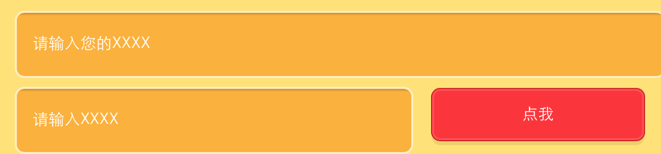
情景: 项目引入了标准的normalize.css, 整个页面设在一个<div class="container"></div>下,由她来控制整个文档流整体的在页面中的显示(如居中,与两边的宽度等)。之后在其内部有一个input输入框,为了让其跨浏览器显示一般我们会将元素的宽度设置成百分比,即设置input的宽度为“100%”,那么问题来了:在PC浏览器上显示正常,但在移动端偏偏input越界了。这令我很是费解,尝试了N中方法就是不行,差点就选择用绝对长度来定位了。如下图:
**解决方法:**没事找我,有事找谷歌。overstack是个好东西,几乎你遇到的问题别人都遇到过了。结果增加了以下代码就ok了:
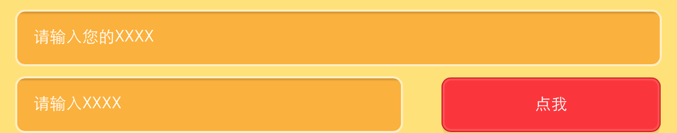
input { width: 100%; box-sizing: border-box; -webkit-box-sizing:border-box; -moz-box-sizing: border-box; } 效果如下:
那么这究竟是为什么呢?为此特意去study了一下...
我们知道每一个元素都有一个盒模型,而世界上存在两种计算元素宽度的方式: 一种是W3C的标准(宽度及为元素的宽度,不包括padding和border),另一种是传统的盒模型(宽度包括了了元素自身的宽度再加上padding和border)。
浏览器一般都是默认按照W3C标准盒模型来计算元素宽度的(除了IE的“Quirks Mode”).
比如:两种模式下相同样式不同结果
.demo { width: 250px; height: 100px; border: 5px solid #6374AB; padding: 10px; }第一个使用传统的盒模型,第二个使用W3C的盒模型,效果如下:
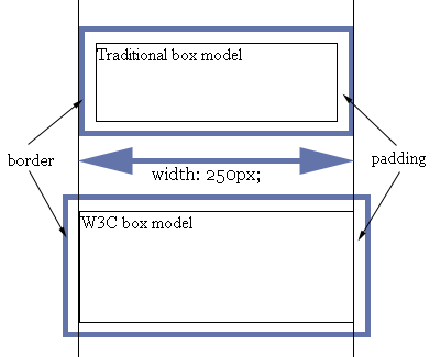
区别很明显,传统的盒模型中元素的宽度就是content + padding + border,而W3C的盒模型中元素的宽度是content。这就解释了为什么input输入框设置了100%会超出父类宽度了。因为当时环境中是width=100%,但padding和border不包括在这100%的宽度中,故渲染出来的宽度大于100%。
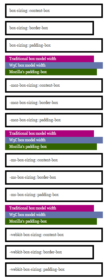
显然,按照传统的盒模型比较好控制。css3中出现了box-sizing属性,允许你切换盒模型:
box-sizing: border-box; box-sizing: content-box;box-sizing: border-box表示元素的大小是包括border以内的所有宽度,即传统盒模型,而box-sizing: content-box表示元素的宽度即content的宽度,不包括padding、border。
Mozilla支持padding-box,即表示元素的大小是padding以内的宽度,不包括border。
更精确的测试如下:
div.test { width: 300px; padding: 10px; border: 5px solid #000000; margin-left: 10%; margin-bottom: 10px; margin-top: 10px; }效果如下:
经此一役,恍然大悟。于是在normalize.css加上一下代码,确保万无一失:
/*清除浮动*/ .clearfix:before, .clearfix:after { content: ''; display: table; } .clearfix:after { clear: both; overflow: hidden; } .clearfix { zoom: 1; } /*设置所有元素为传统盒模型*/ *, *:before, *:after { -webkit-box-sizing: border-box; -moz-box-sizing: border-box; box-sizing: border-box; }<a name="0002">二、safari下input输入框有内描边及webkit css 整理</a>
webkit内核浏览器默认会给input输入框加上内描边,这对专业的设计师来说是不能容忍的。而前端叉子们就得想尽办法出去她~ 多悲伤啊,人家浏览器也是为了你好,至于么???? 代码如下:
input { -webkit-appearance: none; // Safari 去掉内阴影 }移动端中,使用click会出现绑定点击区域有高亮背景,修改背景颜色方法:
input{ -webkit-tap-highlight-color: rgba(0,0,0,0); // 设置点击区域的颜色 }ios中滑动效果:
body{ -webkit-overflow-scrolling: touch; }好吧,webkit属性太多,整体把握才是王道,于是整理如下:
1. "box model"相关,包括content、padding、margin等
-webkit-border-bottom-left-radius: radius; -webkit-border-top-left-radius: horizontal_radius vertical_radius; -webkit-border-radius: radius; //容器圆角 -webkit-box-sizing: sizing_model; 边框常量值:border-box/content-box -webkit-box-shadow: hoff voff blur color; //容器阴影(参数分别为:水平X 方向偏移量;垂直Y 方向偏移量;高斯模糊半径值;阴影颜色值) -webkit-margin-bottom-collapse: collapse_behavior; 常量值:collapse/discard/separate -webkit-margin-start: width; -webkit-padding-start: width; -webkit-border-image: url(borderimg.gif) 25 25 25 25 round/stretch round/stretch; -webkit-appearance: push-button; //内置的CSS 表现,暂时只支持push-button2. 视觉格式化模型”描述性质,确定了位置和大小的块元素
clip: rect(10px, 5px, 10px, 5px) resize: auto; 常量:auto/both/horizontal/none/vertical visibility: visible; 常量: collapse/hidden/visible -webkit-transition: opacity 1s linear; 动画效果 ease/linear/ease-in/ease-out/ease-in-out -webkit-backface-visibility: visibler; 常量:visible(默认值)/hidden -webkit-box-reflect: right 1px; //镜向反转 -webkit-box-reflect: below 4px -webkit-gradient(linear, left top, left bottom,from(transparent), color-stop(0.5, transparent), to(white)); -webkit-mask-image: -webkit-gradient(linear, left top, left bottom, from(rgba(0,0,0,1)), to(rgba(0,0,0,0)));; //CSS 遮罩/蒙板效果 -webkit-mask-attachment: fixed; 常量:fixed/scroll -webkit-perspective: value; 常量:none(默认) -webkit-perspective-origin: left top; -webkit-transform: rotate(5deg); -webkit-transform-style: preserve-3d; 常量:flat/preserve-3d; (2D 与3D)3.“颜色和背景”描述属性控制背景下的块级元素和颜色的文本内容的组成部分
-webkit-background-clip: content; 常量:border/content/padding/text -webkit-background-origin: padding; 常量:border/content/padding/text -webkit-background-size: 55px; 常量:length/length_x/length_y4. “文本”描述属性的特定文字样式,间距和自动滚屏
text-shadow: #00FFFC 10px 10px 5px; text-transform: capitalize; 常量:capitalize/lowercase/none/uppercase word-wrap: break-word; 常量:break-word/normal -webkit-marquee: right large infinite normal 10s; 常量:direction(方向) increment(迭代次数) repetition(重复) style(样式) speed(速度); -webkit-marquee-direction: ahead/auto/backwards/down/forwards/left/reverse/right/up -webkit-marquee-incrementt: 1-n/infinite(无穷次) -webkit-marquee-speed: fast/normal/slow -webkit-marquee-style: alternate/none/scroll/slide -webkit-text-fill-color: #ff6600; 常量:capitalize, lowercase, none, uppercase -webkit-text-security: circle; 常量:circle/disc/none/square // 如密码输入框使用该属性 -webkit-text-size-adjust: none; 常量:auto/none; //阻止屏幕旋转时字体自动调整 -webkit-text-stroke: 15px #fff; -webkit-line-break: after-white-space; 常量:normal/after-white-space -webkit-appearance: caps-lock-indicator; -webkit-nbsp-mode: space; 常量: normal/space -webkit-rtl-ordering: logical; 常量:visual/logical -webkit-user-drag: element; 常量:element/auto/none -webkit-user-modify: read-only; 常量:read-write-plaintext-only/read-write/read-only -webkit-user-select: text; 常量:text/auto/none // 是否允许用户选中文本 -webkit-touch-callout:none //禁止 iOS 弹出各种操作窗口 input::-webkit-input-speech-button {display: none} // Andriod 上去掉语音输入按钮5. “表格”描述的布局和设计性能表的具体内容
-webkit-border-horizontal-spacing: 2px; -webkit-border-vertical-spacing: 2px; -webkit-column-break-after: right; 常量:always/auto/avoid/left/right -webkit-column-break-before: right; 常量:always/auto/avoid/left/right –webkit-column-break-inside: logical; 常量:avoid/auto -webkit-column-count: 3; //分栏 -webkit-column-rule: 1px solid #fff; style:dashed,dotted,double,groove,hidden,inset,none,outset,ridge,solid6. “用户界面”描述属性,涉及到用户界面元素在浏览器中,如滚动文字区,滚动条,等等
-webkit-box-align: baseline,center,end,start,stretch 常量:baseline/center/end/start/stretch -webkit-box-direction: normal;常量:normal/reverse -webkit-box-flex: flex_valuet -webkit-box-flex-group: group_number -webkit-box-lines: multiple; 常量:multiple/single -webkit-box-ordinal-group: group_number -webkit-box-orient: block-axis; 常量:block-axis/horizontal/inline-axis/vertical/orientation –webkit-box-pack: alignment; 常量:center/end/justify/start7. 动画过渡
-webkit-animation: title infinite ease-in-out 3s; animation 有这几个属性: -webkit-animation-name: //属性名,就是我们定义的keyframes -webkit-animation-duration:3s //持续时间 -webkit-animation-timing-function: //过渡类型:ease/ linear(线性) /ease-in(慢到快)/ease-out(快到慢) /ease-in-out(慢到快再到慢) /cubic-bezier -webkit-animation-delay:10ms //动画延迟(默认0) -webkit-animation-iteration-count: //循环次数(默认1),infinite 为无限 -webkit-animation-direction: //动画方式:normal(默认 正向播放); alternate(交替方向,第偶数次正向播放,第奇数次反向播放)<a name="0003">三、移动端最佳使用单位</a>
移动端使用什么单位是开发者最迫切需要知道的,px、%、pt、em 还是rem? 当然是rem。rem是非常好用的一个属性,可以根据html来设定基准值,而且兼容性也很不错。不过有的时候还是需要对一些莫名其妙的浏览器优雅降级。可以用以下的代码片段保证在低端浏览器下也不会出问题:
html { font-size: 62.5%; } body { font-size: 14px; font-size: 1.4rem; } /* =14px */ h1 { font-size: 24px; font-size: 2.4rem; } /* =24px */<a name="0004">四、模拟:hover伪类</a>
由于移动端没有鼠标指针,所以没有hover事件,所以css:hover伪类就没用了。但是移动端有touch事件,onTouchStart 类似 onMouseOver,onTouchEnd 类似 onMouseOut。所以我们可以用它来模拟hover。使用Javascript:
var myLinks = document.getElementsByTagName('a'); for(var i = 0, len = myLinks.length ; i < len; i++){ myLinks[i].addEventListener(’touchstart’, function(){this.className = “hover”;}, false); myLinks[i].addEventListener(’touchend’, function(){this.className = “”;}, false); }然后用css增加hover效果:
a:hover, a:hover {/* 你要的效果*/}这样设计一个链接,感觉可以更像按钮。并且,这个模拟可以用在任何元素上。
<a name="0005">五、input类型为date情况下不支持placeholder</a>
由于浏览器会针对date类型的input增加datepicker模块,所以有些系统不支持placeholder:
桌面端(Mac)
- Safari 不支持 datepicker,placeholder 正常显示。
- Firefox 不支持 datepicker,placeholder 正常显示。
- Chrome 支持 datepicker,显示 年、月、日 格式,忽略placeholder。
移动端
- iPhone5 iOS7 有 datepicker 功能,但是不显示 placeholder。
- Andorid 4.0.4 无 datepicker 功能,不显示 placeholder
解决方法:
<input placeholder="Date" class="textbox-n" type="text" onfocus="(this.type='date')" id="date">因为text是支持placeholder的。因此当用户focus的时候自动把type类型改变为date,这样既有placeholder也有datepicker了。
<a name="0006">六、active的兼容</a>
要让a链接的CSS active伪类生效,只需要给这个a链接的touch系列的任意事件touchstart/touchend绑定一个空的匿名方法即可hack成功:
<style> a { color: #000; } a:active { color: #fff; } </style> <a herf=”asdasd”>asdasd</a> <script> var a=document.getElementsByTagName(‘a’); for(var i=0;i<a.length;i++){ a[i].addEventListener(‘touchstart’,function(){},false); } </script><a name="0007">七、测试是否支持svg</a>
用以下代码:
document.implementation.hasFeature("http:// www.w3.org/TR/SVG11/feature#Image", "1.1");<a name="0008">八、ios下的隐私模式</a>
这个“隐私模式”是最容易被忽视的。ios的safari提供一种“隐私模式”,如果你的webapp没有考虑这个兼容模式,那么在使用html5的本地存储的“localstorage”时,可能因为“隐私模式”下没有权限读写localstorage而使代码抛出错误,导致后续的js代码无法运行~
所以在使用localstorage的时候,首先应该判断是否支持localstorage。但是问题又来了:测试发现,即使在safari的“隐私模式”下,’localStorage’ in window的返回值依然为true,也就是不能用“'localStorage' in window”来判断。接下来只能相当使用try catch了,虽然这是一个不太推荐被使用的方法,使用try catch捕获错误,使后续的js代码可以继续运行,代码如下:
try{ if('localStorage' in window){ //需要使用localStorage的代码写在这 }else{ //不支持的提示和向下兼容代码 } }catch(e){ // 隐私模式相关提示代码和不支持的提示和向下兼容代码 }所以,在需要兼容ios的safari的“隐私模式”的情况下,本地存储相关的代码需要使用try catch包裹并降级兼容。如果不知道的话,呵呵,那就惨了!!!!!
<a name="0009">九、中文输入法输入英文,字母之间可能会出现一个六分之一空格</a>
关于 iOS 系统中,中文输入法输入英文时,字母之间可能会出现一个六分之一空格,可以使用正则表达式过滤:
this.value = this.value.replace(//u2006/g, '');<a name="0010">十、关于音频跟视频</a>
代码:
<audio autoplay> <source src="audio/alarm1.mp3" type="audio/mpeg"> </audio>如上代码,系统默认情况下audio的autoplay属性是无法生效的,这也是手机为节省用户流量做的考虑。如果必须要自动播放,有两种方式可以解决。
1.捕捉一次用户输入后,让音频加载,下次即可播放
//play and pause it once document.addEventListener('touchstart', function () { document.getElementsByTagName('audio')[0].play(); document.getElementsByTagName('audio')[0].pause(); });这种方法需要捕获一次用户的点击事件来促使音频跟视频加载。当加载后,你就可以用javascript控制音频的播放了,如调用audio.play().
2. 利用iframe加载资源
var ifr=document.createElement("iframe"); ifr.setAttribute('src', "http://mysite.com/myvideo.mp4"); ifr.setAttribute('width', '1px'); ifr.setAttribute('height', '1px'); ifr.setAttribute('scrolling', 'no'); ifr.style.border="0px"; document.body.appendChild(ifr);这种方式其实跟第一种原理是一样的。当资源加载了你就可以控制播放了,但是这里使用iframe来加载,相当于直接触发资源加载。 注意,使用创建audio标签并让其加载的方式是不可行的。 慎用这种方法,会对用户造成很糟糕的影响。
<span style="font-weight:bold;color:green;font-size:18px;">>> 持续踩坑中...</span>
